Tail Wag Treats
OVERVIEW
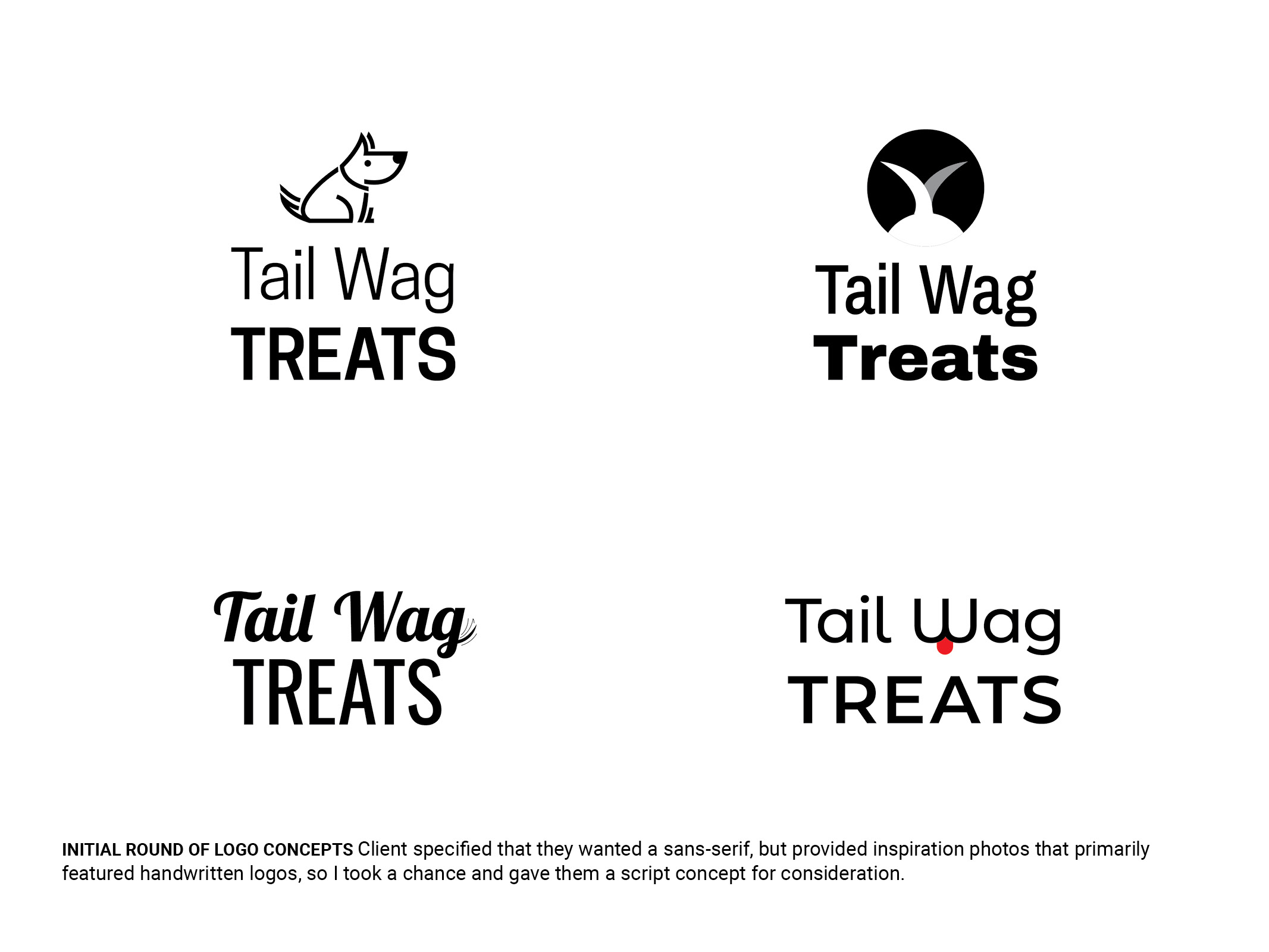
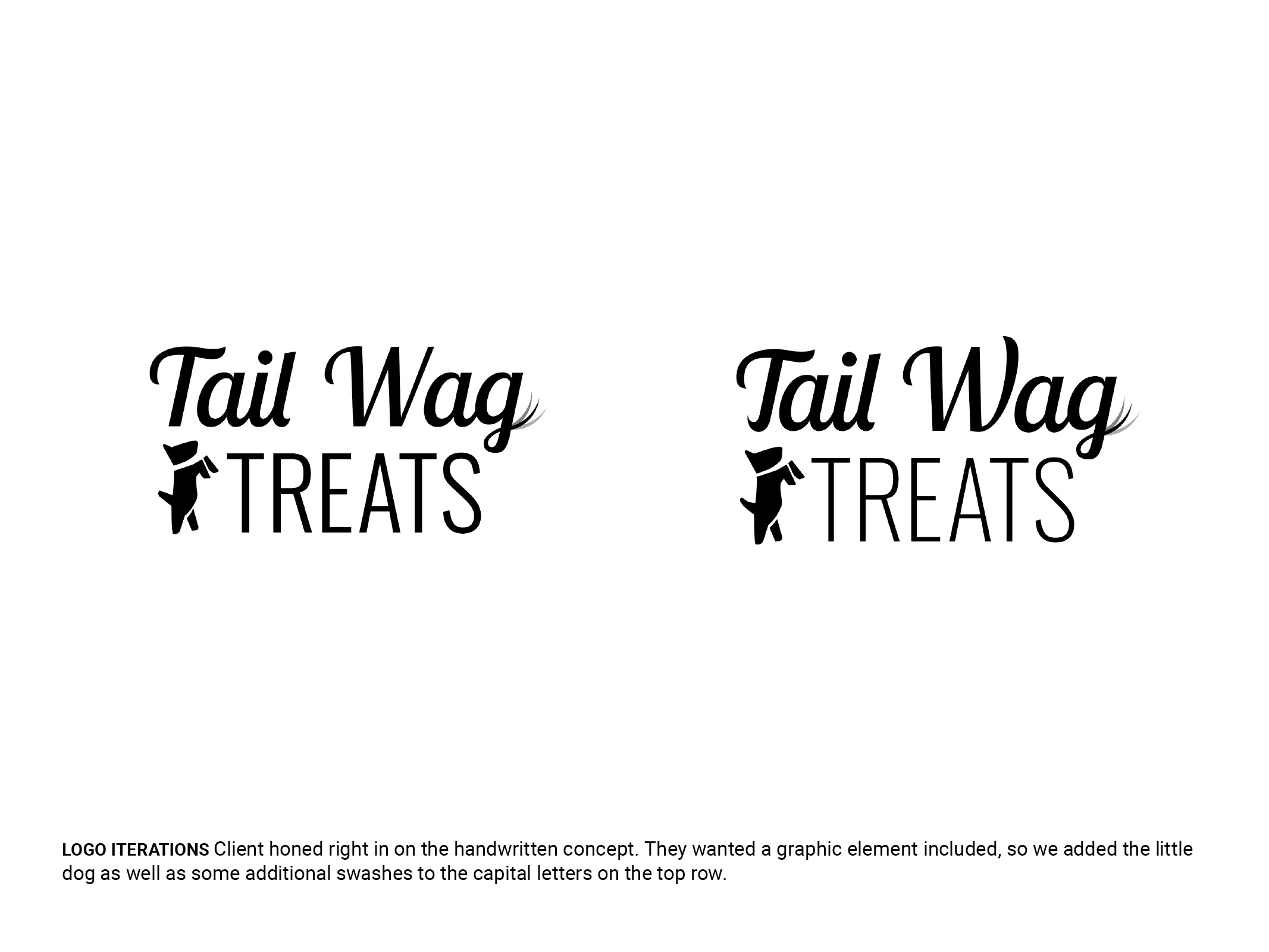
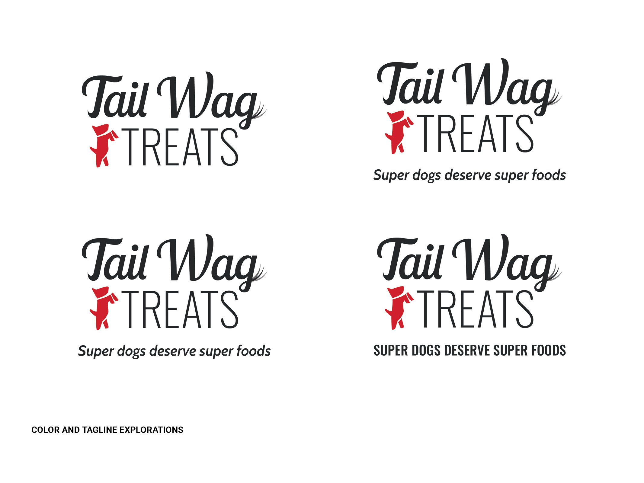
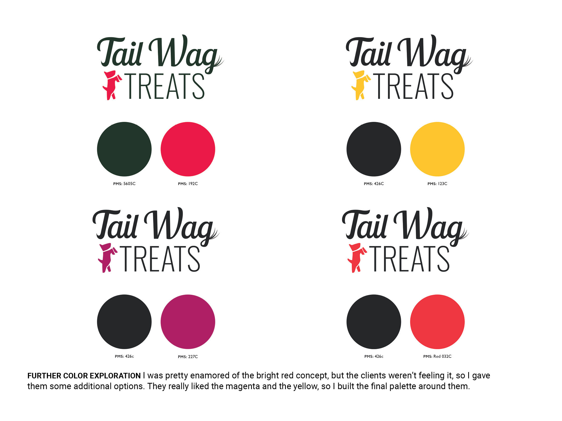
My primary goals for this project were to create a fun and energetic brand that would stand out in a crowded marketplace. The clients really wanted a graphic element that could also stand on it’s own for social avatars and merchandise, so I came up with the cute little dog – based on one of the founder’s cute little terrier mix. I drew a lot of my inspiration for the type and color palette from human juice/wellness brands. The script font was also selected to evoke the handmade goods found at farmers markets and the like.
Client description:
Start-up specializing in high-end dog treatsProject deliverables:
Logo, one-sheet, packaging labelsRoles and responsibilities:
Logo and print design, production file creationPACKAGING LABEL
To keep packaging costs down, the client wanted a series of labels that they could apply to their vacuum sealed bags. I worked with them to find a size that would allow us to fit all of the FDA required elements and still allow for a nice-looking design.


